The Colour of a Flame, and What "White" Means
In the previous post we built the chromaticity horseshoe from four constraints on a change of basis, and along the way pinned two points inside it: the equal-energy white , dead centre by construction, and the ordinary daylight white , sitting slightly toward blue at — with a promise, left dangling, that the colour of white itself would be the subject of the next post. Two different whites already implies that white is not one point but a choice, and the puzzle only deepens once you notice that a candle, a fluorescent tube, and an overcast sky all get called “white” by the eye that is looking at them, despite putting out nothing alike. What, then, does a light source have to do to earn the name?
Push an iron poker into a bed of coals and hold it there. For the first minute nothing visible happens — the metal is radiating, but only in the infrared, where no eye can follow it. Then, past some threshold, a dull red glow creeps in at the tip. Leave it in and the red deepens toward cherry, then brightens and slides toward orange, then a hot yellow-white a blacksmith would call welding heat, and if you had a furnace hot enough to keep pushing — past anything iron survives — the glow would keep sliding, through a searing white, into a faint and eerie blue. No dye did any of that, no pigment, no filter. The metal’s temperature alone dictated its colour, in a fixed and universal order that has nothing to do with what the metal is made of. The night sky repeats the same trick at a scale no forge will ever reach: Betelgeuse, the red shoulder of Orion, has a surface temperature of only about and reads to the naked eye as a deep, sullen orange-red , while Rigel, diagonally opposite in the same constellation, runs closer to and burns blue-white . Between them, at a temperature so nearly right for producing every visible wavelength in roughly equal measure, sits the Sun, whose light reads — to an eye that evolved under it — as colourless. Poker and star alike are one physical law wearing different costumes, and every other definition of “white” this post reaches for turns out, in the end, to be parasitic on that law.
Planck’s law, and the colour of a heated poker
The problem the poker poses is old, and for four decades it defeated physics’s best. In 1859, Gustav Kirchhoff, newly arrived at Heidelberg, proved a deceptively simple theorem: for any object in thermal equilibrium with its surroundings, the ratio of how much it emits to how much it absorbs, at each wavelength, is a single universal function of wavelength and temperature — the same function for a poker, a star, or a lump of coal, regardless of what any of them is made of. He coined the term schwarzer Körper — blackbody — for the idealised perfect absorber whose emission is exactly that universal function, and the function itself then sat unsolved for forty years, a named prize with no one able to claim it.
The pieces arrived in order. Josef Stefan measured, empirically, that a hot object’s total radiated power scales as the fourth power of its absolute temperature; his student Ludwig Boltzmann derived the same law thermodynamically five years later, and the pairing is remembered as the Stefan–Boltzmann law. Wilhelm Wien, at the Physikalisch-Technische Reichsanstalt in Berlin, showed in 1893 that thermodynamic reasoning alone constrains the curve’s shape far more tightly than anyone had realised — that whatever the true spectral function turns out to be, its peak has to drift toward shorter wavelengths as temperature rises, in a fixed proportion this section will shortly write down — a result that won him the 1911 Nobel Prize. Wien also proposed an explicit formula in 1896 that fit the short-wavelength data beautifully and the long-wavelength data not at all, a mismatch a Berlin team — Otto Lummer and Ernst Pringsheim, with Heinrich Rubens and Ferdinand Kurlbaum — nailed down by 1900 with a new cavity design precise enough to measure the far infrared for the first time. Wien’s curve worked at one end of the spectrum and broke at the other, and nobody had a formula that did both.
Now to make this precise. Planck’s interpolation, cleaned up in the modern SI, gives the spectral radiance of a blackbody at absolute temperature as a function of wavelength .
is the whole content of the poker’s glow. Fix a wavelength and increase : the exponent shrinks, the denominator shrinks, and climbs — every wavelength brightens as the object heats, which is obvious enough. What is not obvious, and what the naked eye reads directly off the poker, is how the balance between wavelengths shifts. At room temperature the visible-light content of the curve is a rounding error; almost everything sits in the far infrared, radiated as heat with no colour attached, which is why a poker merely sitting in sunlight is not glowing to your eye. Heat it further and the bulk of the curve pushes toward shorter wavelengths fast enough that its tail finally reaches into the end of the visible band — a dull red, because the visible window is now catching only the extreme low-wavelength shoulder of a curve still centred deep in the infrared. Push the temperature higher and the curve’s peak itself crosses into the visible band, painting the reds most strongly at first, then orange, then yellow as shorter wavelengths catch up, and once the peak has swept past the whole visible band the eye starts receiving comparable amounts of every wavelength at once — which is the physical definition of white. Past that, the peak keeps moving into the blue and beyond, the visible window now sees more blue than red, and the glow turns bluish-white, then a colder, harder blue, exactly as the tip of a poker, or the photosphere of Rigel, does.
The whole pipeline — spectrum in, locus point and swatch out — is worth watching happen continuously rather than in the six freeze-frames of the last paragraph. Drag the temperature slider below from a cool ember up past the surface of Rigel and watch the spectral curve, the point it traces on the chromaticity diagram, and the rendered swatch all move together.
W-16 — the blackbody / Planckian-locus explorer. Drag temperature from to and three panels update together: the Planck spectral-radiance curve over the visible band, the point it projects to on the chromaticity diagram, and a swatch of the resulting colour. A toggle normalises each curve to constant area, since without it a curve is nearly invisible next to a one — almost all its power sits off the plotted, infrared end of the axis.
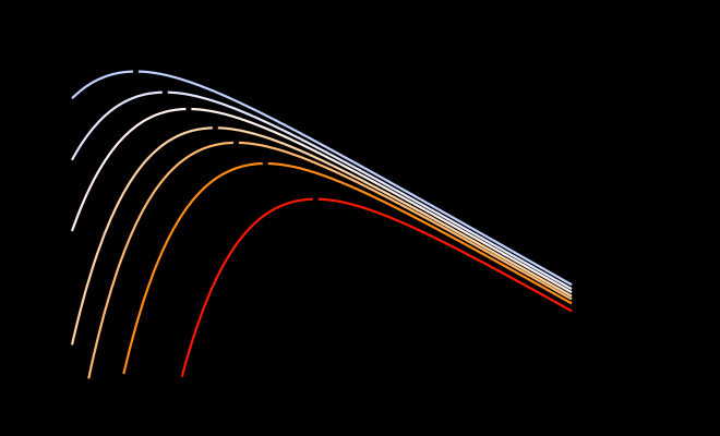
A family of Planck spectral-radiance curves at , plotted on log–log axes with the visible band (–) shaded and each curve’s peak wavelength marked and connected by a faint dashed trace obeying Wien’s law. The curve is labelled as the Sun’s.
Wien and Stefan–Boltzmann: the derivative and the integral
Two of the oldest facts about hot bodies — that hotter objects glow bluer, and that hotter objects glow bright out of all proportion to how much hotter they are — are usually taught as two more laws bolted onto Planck’s afterward. They are not separate laws. Both are Planck’s law, one differentiated and the other integrated.
Both halves fall out of the same substitution. For (a), the extremum of over at fixed coincides with the extremum, over , of — the map is a monotonic relabelling of the independent variable, so wherever one peaks, so does the other. Differentiating and setting the result to zero,
an equation with no closed form, solved numerically for . For (b), the same substitution turns the integral over into an integral over with every factor of pulled cleanly outside:
and the dimensionless integral on the right is a standard Bose–Einstein integral, , independent of by construction. Every power of in the final answer has to come from the substitution, which is exactly why total radiated power scales as a clean fourth power rather than as some transcendental function of temperature.
The same constant that separates a dull ember from a welding torch is what separates Betelgeuse’s glow from Rigel’s blaze — one universal law, running at kitchen-stove temperatures and stellar-photosphere temperatures alike, with nothing about the mechanism caring which.
The Planckian locus and correlated colour temperature
Theorem 6.2 describes a single wavelength axis: how bright a blackbody glows, and where its peak sits. But the eye does not read a spectrum wavelength by wavelength; it collapses one, via the three cone integrals or their standardised proxy, down to a chromaticity, as Post 5 built in detail. Run every Planck curve through that same reduction and a one-parameter family of spectra becomes a one-parameter curve of colours.
For each temperature , feed through the CIE 1931 colour-matching functions exactly as any other spectrum would be:
recalling from Post 5 that , the photopic luminous-efficiency curve met back in Post 3, so is literally the blackbody’s luminance and not a separately computed quantity. Push through the chromaticity projection, and as sweeps from roughly to infinity the resulting point traces a curve across the diagram: entering from deep red at low temperature, sweeping up through orange and yellow, crossing the region called white somewhere near , and continuing on into an ever-colder, ever-bluer white that converges, as , on a fixed point near rather than running off the edge of the diagram. This curve is the Planckian locus — the trace the widget above was drawing all along.

The Planckian locus drawn across the full CIE 1931 chromaticity horseshoe from Post 5, with temperature ticks at and , and a fan of short iso-CCT line segments crossing the locus perpendicular to it, in the CIE 1960 sense, at several of those ticks.
Every point on the locus has an honest temperature. Almost no real light source sits exactly on it — a fluorescent tube, an LED, even the Sun itself misses by a little — and yet everyday speech assigns those sources a colour temperature anyway. What that number means has to be stated carefully, because it throws something away.
Definition 6.3’s honesty matters more in practice than its algebra suggests. Two lamps can share a CCT of exactly — the nearest blackbody temperature agrees — while one sits measurably above the locus and the other measurably below it, and an eye comparing them side by side sees one as faintly greenish and the other as faintly pink, even though a single-number spec sheet calls the two identical. Even the Sun does not sit quite where the shorthand puts it. Integrate the top-of-atmosphere solar spectrum against the colour-matching functions and the nearest point on the locus comes out near — not the effective temperature of the photosphere — with . The Sun, in other words, lands close enough to the locus that the projection throws away almost nothing, and yet the temperature gradient across the photosphere and the cumulative bite the Fraunhofer absorption lines take out of the spectrum are already enough to move the reported temperature by more than a hundred kelvin away from the number a physicist would quote for the same star. The nearest-point projection is not a defect in Definition 6.3; it is the price of collapsing a two-dimensional chromaticity down to the single number “temperature” was always going to be — and daylight, this post’s next subject, pays that price on a scale that makes the Sun’s own displacement look negligible: every CIE D illuminant sits at , a small but perfectly measurable step above the locus, toward green.
For all its honesty about what it throws away, CCT is worth a closed formula, because integrating against the CMFs for every candidate and searching for the nearest point is exactly the kind of thing nobody wants to do by hand.
Daylight is not a blackbody
Post 5 marked D65 at and promised to say, eventually, what makes that particular white the series’ working default. The honest answer starts by admitting D65 is not, and was never meant to be, a point on the Planckian locus at all — despite carrying a number, , that makes it sound like one.
In 1964, Deane Judd, David MacAdam, and Günter Wyszecki, working with four collaborators, pooled 622 measured daylight spectra — ninety-nine from the National Research Council of Canada, two hundred forty-nine taken by Eastman Kodak in Rochester, New York, and two hundred seventy-four gathered near Enfield, England — and ran a characteristic-vector analysis on the collection, the technique now generally called principal component analysis. Three components turned out to reproduce essentially any measured daylight spectrum to high accuracy: a mean spectrum, averaged over all 622 samples, plus two eigenvectors capturing almost all the remaining variance.
The construction is worth sitting with, because the two things being fitted are different in kind. A blackbody curve is a single physical law with one free parameter, temperature. A daylight illuminant is a statistical average of measured skies, with two free parameters standing in for whatever combination of direct sunlight, scattered blue sky, haze, and water vapour happened to be overhead when a spectroradiometer was pointed at a white card in Rochester or Enfield. That the daylight locus sits close to the Planckian locus at all is a real physical fact — the Sun genuinely is close to a blackbody at , and the sky’s own bluish, Rayleigh-scattered tint genuinely does track roughly with temperature, the very mechanism the next post takes up — but close is not on. D65, the illuminant this series has quietly been using as its default since Post 5, is a linear combination of a measured mean spectrum and two measured eigenvectors, dented by the same Fraunhofer absorption lines the Sun itself carries and boosted in the ultraviolet by Rayleigh scattering in a way no blackbody curve ever is, and it carries a CCT of only because that happens to be the temperature of the nearest point, on a different curve, to a chromaticity D65 arrived at by an entirely separate statistical route. No blackbody at , or any other temperature, produces the D65 spectrum, and the CIE says so explicitly: no artificial source is even recommended for realising D65 physically.
The difference is not academic once the two curves sit on the same axes. Toggle between a genuine Planckian radiator and D65 below, alongside Illuminant A’s tungsten curve and an F-series fluorescent’s spike pattern, and watch the white-point dot barely move on the chromaticity diagram while the spectra underneath it diverge completely.
W-17 — the CIE illuminant comparator. Toggle D65, D50, a D-series illuminant at a chosen CCT, Illuminant A, Illuminant E, and an F-series fluorescent on and off, overlaid on shared spectral axes, with each illuminant’s white point plotted on the chromaticity diagram. The fluorescent’s sharp mercury-line spikes against the daylight curves’ smooth undulation is the comparison the widget is built to deliver.

The genuine Planckian spectral radiance curve and the CIE D65 illuminant spectrum, overlaid on the same axes and normalised to agree at . The two curves diverge visibly — D65 dips below the blackbody curve near the sodium D and Fraunhofer wavelengths and rises above it in the near-ultraviolet — while a small inset chromaticity diagram shows their white points sitting almost on top of each other.
The gap between “same white point, different spectrum” and “different white point entirely” is where the industry’s most persistent seam runs. Graphic arts and print colour management standardise on D50 — nominally , true CCT about , chromaticity — because the ICC profile connection space is anchored there and because prints are typically viewed under mixed daylight-and-office light closer to than . Video, web, and most display standards — sRGB, Rec. 709, Display P3, Rec. 2020 — standardise on D65 instead, because a self-luminous display viewed in a dim room reads as neutral only near , and because average outdoor daylight, at the latitudes where most of this was standardised, sits closer to D65 than D50. Neither convention is wrong; each is optimised for a different viewing condition and a different medium, and the split between them — not any single bug — has caused more “why does my print look yellow” and “why does my scan look blue” complaints than almost any other single fact in this series. A finer-grained version of the same argument shows up even between two screens: digital cinema’s DCI-P3 standard specifies a white point near , perceptibly — if only barely — yellower than the of the sRGB screen beside it in the same edit bay, a difference small enough to miss in isolation and obvious the moment the two sit side by side. The next display technology this series covers will pick the white point back up as one third of the recipe behind any screen, alongside primaries and the way each primary is modulated. This book’s own policy, stated once so it need not be repeated: every colour space and computation defaults to D65 unless stated otherwise, and every place D50 intrudes — chiefly the print-facing corners further along in the series — will be flagged explicitly at the point it happens.
The eye’s auto-white-balance
Every illuminant this post has named so far — a poker, the Sun, D65, D50, a tungsten bulb, a fluorescent tube — casts genuinely different light. And yet a sheet of white paper looks white in candlelight, white at noon, and white under fluorescent tubes, even though a spectrometer aimed at it would report three unrelated spectra. The eye is not fooled into ignoring the difference; it actively cancels it, continuously, and mostly without ever alerting you that it is working.
Hermann von Helmholtz noticed, in the 1860s, that a shadow falling on a white object under coloured light tends to look tinted with the complement of the illuminant’s colour, and proposed that some mixture of retinal bleaching and unconscious inference was cancelling the cast on the lit parts of the same scene. The clean, quantitative version of the idea came from one of his students.
Cone photopigments genuinely do bleach in proportion to the light striking them, which gives the slow, seconds-to-minutes component of adaptation a real physiological mechanism to sit on , and the diagonal-gain model that mechanism suggests turns out to predict a remarkable range of everyday experience. Step from bright sun into a room lit by an old tungsten bulb and the world looks, for perhaps a second, faintly orange — and then it does not. Within a minute or two the visual system has re-gained each cone channel to treat the tungsten spectrum as the new white, and a sheet of paper a photometer would call quite orange reads, once again, as simply white. Paint a wall by that same tungsten light for an evening and the colour looks perfectly reasonable the whole time; return the next morning under daylight and the same wall can look shockingly, garishly yellow — not because the wall changed, but because the adaptation quietly discounting the tungsten cast overnight reset itself back to daylight. The same mechanism is why a computer or cinema screen can pass, convincingly, as a window: a display’s white point is not neutral in any absolute sense — it is a manufactured spectrum, three or more narrow-band phosphors or LEDs summed to a chosen chromaticity — and it reads as neutral only because the viewer has adapted to it as the room’s reference white. Chromatic adaptation, seen this way, is the eye discounting the illuminant: subtracting out, cone channel by cone channel, whatever the ambient light is doing, so that what gets reported upward tracks an object’s reflectance more closely than the product of reflectance and illuminant. It is the mechanism behind colour constancy at the scale of a whole visual scene, and this series will meet it again, scaled considerably up, when the same pixels divide the internet over which illuminant two different brains have each silently discounted.
The clearest demonstration of adaptation at work does not require waiting a minute in a tungsten room; it can be staged directly with two pictures. Below, a beach scene shot in daylight has been white-balanced as though it were lit by tungsten — correcting for a cast that was never actually there — which leaves the whole frame blue and a raft floating offshore reading as unmistakably yellow. Now undo that correction on every pixel in the frame except the raft. The raft’s pixel values do not change at all, yet against a scene that suddenly looks correctly balanced it reads as a lime-green float; toggle between the two and watch the one patch of unchanging colour swap identity under your own eyes.
W-18 — chromatic adaptation and white balance. Choose a source and a destination illuminant (D65, D50, A, or a custom CCT) and a transform (true-cone von Kries, Bradford, CAT02, CAT16), and a running-example scene renders raw versus adapted, with a toggle to apply the correction everywhere except one marked object — the raft trick above. A matrix panel shows the diagonal gain in whichever cone-like basis the chosen transform uses.
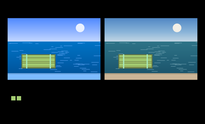
A synthetic scene shown twice — computed from the CIE illuminants and a Bradford transform, not photographed. Left, the whole frame has been white-balanced for tungsten, correcting for a cast that was never there and leaving everything blue; the raft reads yellow. Right, that correction has been undone everywhere except the raft, so sky, sea and sand look correctly balanced while the raft, whose pixel values are byte-for-byte identical to the left panel, now reads green. A callout states the raft’s exact sRGB triple in both panels, to remove any doubt that only the surround changed.
The wrong von Kries
Definition 6.6 says the diagonal gain belongs in the cone basis — genuine LMS, the same coordinates Post 5 used for the physiological cone responses. Wolfgang Terstiege, in 1972, gave that constraint a name by naming its violation: adapting by a diagonal scaling in any other linear basis, he called wrong von Kries, and the single most common wrong basis in mid-twentieth-century industrial colorimetry was XYZ itself.
Here is where Post 5 left a debt uncollected. When that post needed a fixed matrix carrying XYZ into LMS, it chose Hunt–Pointer–Estévez and flagged, without explaining, that Bradford and CAT02 — two other members of the small zoo of XYZ→LMS matrices in circulation — are not attempts at cone fundamentals at all, and that they would reappear here in a different role. The role is this: genuine von Kries, run in the actual physiologically measured cone basis, does not fit corresponding-colour data as well as a diagonal scaling run in a deliberately distorted cone-like basis — one narrower, more separated, and less correlated between channels than the real , , and sensitivities ever are.
A modern chromatic-adaptation transform (CAT) generalises Definition 6.6 by inserting a change of basis on either side of the diagonal scaling. Given a source white and destination white in XYZ, and a chosen sharpening matrix ,
composing to a single fixed matrix once the two whites are fixed. Genuine von Kries takes to be a physiological cone matrix, HPE say; wrong von Kries takes , scaling directly in XYZ. The Bradford matrix, extracted by King Man Lam at the University of Bradford in 1985 from fifty-eight pairs of colours matched by observers adapted first to Illuminant A and then to D65,
and CAT02, fitted twenty years later to a much larger corresponding-colour dataset for the CIECAM02 colour-appearance model, both fit their corresponding-colour data better than the identical pipeline run with , the physiologically grounded matrix Post 5 chose as its default LMS.
The reason is not that Bradford and CAT02 are secretly better guesses at the cones. Finlayson, Drew, and Funt showed in 1994 that von Kries’s independent-gain assumption is exactly correct only when the sensor basis is sufficiently narrow relative to the illuminants and surfaces in play, and real cones — whose sensitivities overlap substantially across the visible band — do not satisfy that condition well. A spectrally sharpened basis — narrower, more separated, engineered rather than measured — restores the condition von Kries’s diagonal argument actually needs, at the cost of no longer describing anything a photoreceptor does. Bradford and CAT02 are that engineering move made concrete: not cone spaces, in the sense Post 5 used the term, but adaptation spaces, built so a diagonal matrix can punch above the weight a true diagonal in LMS ever could.

Two small diagrams side by side, both drawn in the LMS-cube visual language established in Post 5. Left: von Kries’s diagonal scaling, drawn as three independent arrows scaling along the , , cone axes directly. Right: the Bradford transform, drawn as a rotation into a sharpened, narrower-lobed basis, the same diagonal scaling applied there, and a rotation back — “scale where you are” against “rotate, scale, rotate back.”
The pattern here is one this series will meet twice more, in different costumes. CIELAB, two posts from now, applies its own perceptual compression directly to XYZ rather than to anything cone-shaped — the same wrong-von-Kries mistake, wearing a different name. OkLab, several posts further on, does its defining nonlinearity inside a deliberately cone-like basis instead, for precisely the reason Bradford and CAT02 adapt where they do rather than in XYZ: colour arithmetic that respects the eye wants to be done close to the cones, sharpened or not, and arithmetic done in XYZ for the sake of XYZ’s own convenient axioms keeps quietly getting the wrong answer.
The moral of a heated poker, a star, a sheet of daylight-standardised paper, and a lime-green raft turns out to be the same moral in every case. Colour is never a fact about a spectrum sitting still. It is always a spectrum read against an assumed illuminant, by a system constantly and invisibly renegotiating what counts as white — and “white,” despite feeling like the one fixed point in the whole business, has turned out to be the most negotiated colour of all.