Smaller Than a Full Stop
In the previous post we watched Newton’s prism fan white light into an oblong ribbon and drew the uncomfortable lesson that colour is not a property of light but a verdict the eye returns — that the names we give the spectrum are conventions rhymed with a musical scale, not facts of physics. That left a question dangling. If the spectrum is a smooth continuum of wavelengths, an infinite-dimensional thing, what in the eye collapses it into the handful of colours we actually experience?
The answer hides in a patch of tissue smaller than the full stop at the end of this sentence. Press your gaze to a single printed word and the part of it you see sharply — the part not smeared into the grey of peripheral vision — is read out by a hexagonal mosaic of cone cells packed into the fovea, the pit at the centre of the retina, at something like 160,000 to the square millimetre. There are three kinds of cone. The entire edifice of colour science — every display you have ever looked at, every colour name in every language, the whole apparatus of metamerism and gamuts and impossible colours this series will spend seventeen posts unpacking — rests on the brute anatomical fact that the number is exactly three.
(A convention before we begin, restated in case you have landed here cold: wavelengths are quoted in nanometres, written nm, and the visible band runs from roughly to , with – the tighter range where most of the action lives.)
A camera with aberrations
It is tempting to describe the eye as a camera, and the comparison is fair as far as it goes: a cornea and a lens at the front, an aperture (the pupil) that opens and closes, and a light-sensitive surface (the retina) at the back. But a camera designer handed the human eye as a prototype would send it back. It is a camera with serious, uncorrected aberrations, and the shape of those defects turns out to be load-bearing for everything that follows.

Cross-section of the human eye: cornea, pupil, crystalline lens, vitreous body, retina, the foveal pit at the optical axis, and the optic disc (blind spot) where the nerve fibres exit. The fovea is the only patch built for sharp, full-colour vision.
The first defect is chromatic, and it is the same defect Newton’s prism had — only now it is working against us inside our own optics. A simple lens bends short wavelengths more than long ones, by exactly the dispersion that opened the oblong ribbon, so the eye cannot bring all wavelengths to a focus on the retina at once. When red is sharp, blue is focused slightly in front of the retina and lands as a faint halo; when blue is sharp, red has slid behind. The eye is never, for any scene, in focus across the whole spectrum, and there is no accommodation of the lens that fixes it — chromatic aberration is a property of the glass, not of the focus. The effect is small but real, and you have felt it. Saturated blue text on a saturated red background seems to shimmer and float, an illusion of depth called chromostereopsis: because the two colours focus at different depths and enter the pupil at slightly different angles, the brain, doing what it always does with a depth cue, reads the difference as one colour standing in front of the other. It is nothing more than the visual system trying to make sense of two colours it literally cannot focus together, and it is the reason a certain kind of red-on-blue signage seems to vibrate.
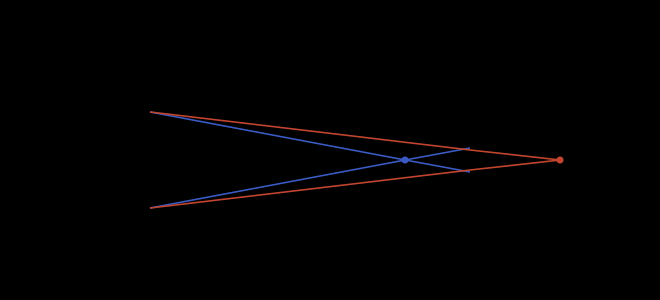
Longitudinal chromatic aberration: the eye’s optics focus short-wavelength (blue) light in front of the retina and long-wavelength (red) light behind it. No single accommodation brings the whole spectrum to a point.
The second defect is a hole. Where the optic nerve punches through the retina to carry signals to the brain there are no photoreceptors at all — a blind spot of about five degrees, off to the nasal side, that you never notice because the brain quietly paints over it with a guess at what should be there. The third is the most consequential for us: acuity collapses almost immediately away from the fovea. Move a few degrees off the point you are fixating and resolution, and colour discrimination with it, falls off a cliff. Colour is, to a startling degree, a phenomenon of the central two degrees of your vision; the periphery is a low-resolution, colour-impoverished motion detector that the brain dresses up as a full, vivid field. The vividness you seem to see everywhere is, in large part, the brain’s confident reconstruction — the same trick it pulls over the blind spot, run across the whole visual field.
You can feel that cliff for yourself. Fix your eyes on the cross below and, without letting them drift, try to name the colour of the patch off to the side — then drag the patch further out and try again.
P-B — colour at the edge of sight. Hold your gaze on the central cross: the patch in your periphery is hard to identify by colour long before it is hard to see, because sharp, full-colour vision is confined to the central ~2° (the dashed disc). The simulate the periphery toggle washes the patch toward grey to approximate the percept; the real effect needs your own steady fixation.
That last fact is why the standards we will meet later quietly assume a thumbnail-sized patch of vision, and we will return to it in the section on the standard observer. But the deep idea — that the dimensionality of colour is a fact about the eye, not about the light — is older than any standard, and it arrived in a single paragraph.
Young had no way to see the three receptors. We can. An adaptive-optics ophthalmoscope, correcting the very aberrations described above, can resolve the living cone mosaic cell by cell — and when it does, the three kinds of cone are revealed to have been badly named for a century.
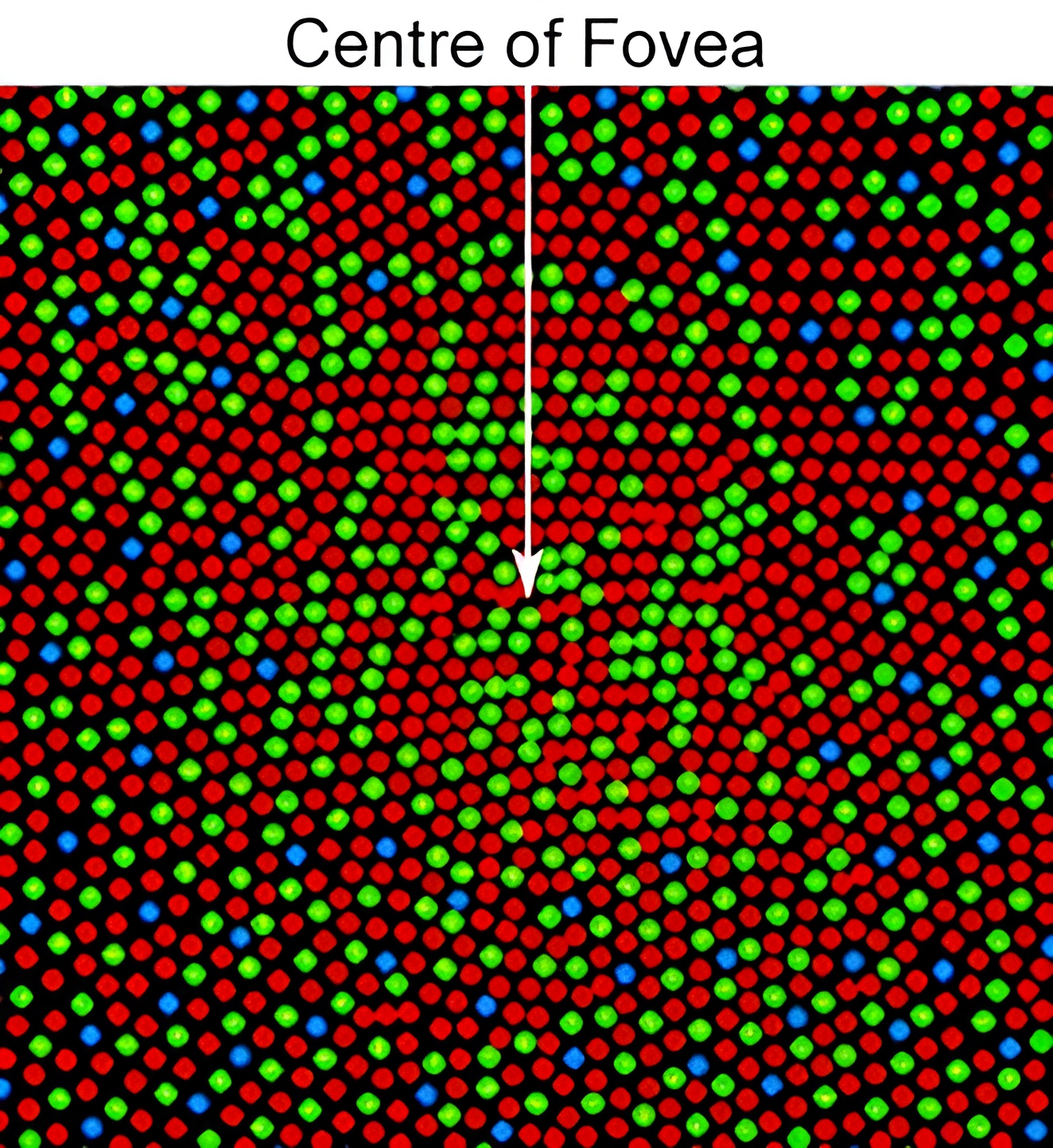
The living cone mosaic at the centre of the fovea, imaged through an adaptive-optics ophthalmoscope and false-coloured by cone class — L red, M green, S blue. Three things to notice: the arrangement is random and patchy, not a tidy lattice; the L and M cones vastly outnumber the sparse S cones; and the colours here are a labelling convention, assigned by the experimenters, not the cones’ own — which is exactly the misnomer the next section takes apart.
Three pigments, badly named
There are three classes of cone, and they are conventionally called the red, green, and blue cones. This is the single most consequential error in popular colour science, and it is worth dismantling carefully, because almost every later confusion in the series is a descendant of it.
Each cone class is defined by the photopigment it carries, and each has a spectral sensitivity — a curve giving how strongly it responds to light of each wavelength. The modern reference curves, the Stockman & Sharpe (2000) cone fundamentals adopted by the CIE, peak at
These are the peaks of the sensitivity curves the eye actually applies — after the lens and the yellow macular pigment have filtered the incoming light. The bare photopigments absorb most strongly a little shorter, near , , and ; it is the filtered fundamentals, not the raw pigments, that the rest of this series will integrate against.
We name the classes not by colour but by where they peak: L for long-wavelength, M for medium, S for short. And the names matter, because the so-called “red” cone, the L cone, peaks at — which is not red at all. It is in the yellow-green, a good – short of anything most people would call red. The M cone peaks slightly greener still, and only the S cone, at , sits near the colour (a deep blue, edging into violet) its nickname suggests. To call the L cone the red cone is to misname it by the width of the entire orange band.
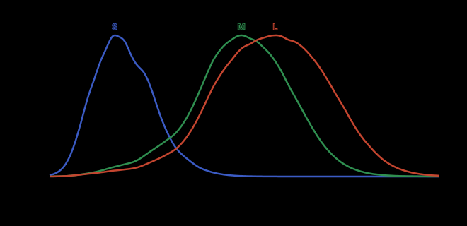
The Stockman–Sharpe cone fundamentals , , , peaks marked at , , and . The “red / green / blue” labels are struck through; the heavy overlap of the L and M curves is shaded. Static companion to the widget below.
Now to make the response precise. A stimulus arriving at the retina is a spectral power distribution — energy per unit wavelength, a function on the visible band, and therefore a point in an infinite-dimensional space. Each cone class integrates that spectrum against its own sensitivity curve. Writing the three Stockman–Sharpe fundamentals as , , , the cone responses are
the integral running over the visible range. This is the whole transduction, stated once. Each integral is an inner product: it pairs the incoming spectrum with one fixed sensitivity curve and returns a single number, the total drive to that cone class. Three curves, three inner products, three numbers — and from this point on, everything the rest of the visual system knows about the light it received is those three numbers. The spectrum itself is gone; the cones do not store it.
The fundamentals are usually tabulated in normalised form — each curve scaled to peak at — which is a convention about units, not about the eye. Normalisation makes the three curves easy to overlay and compare, but it discards the relative gains between cone classes; when absolute luminance matters we will have to put those gains back. (The choice of normalisation is exactly the kind of thing this series refuses to change silently. When it bites, we will say so.)
This is worth meeting with your hands rather than in prose: drag the wavelength marker across the spectrum and watch all three cones respond at once.
W-02 — the cone response reader. Drag the wavelength slider to read the triple at each ; the renormalise toggle rescales the three curves to equal height.
What you should notice is that there is no wavelength at which only the “red” cone fires. At — an unambiguous orange-red — the L cone leads, but the M cone is responding at better than half strength, and even at the L peak near the M cone is nearly as loud. The light that most isolates the L cone is not red light at all. There is no pure “red cone signal” to be had from any single wavelength, which is the first sign that reading colour off these three numbers is going to be subtler than reading three labelled dials.
Colour lives in a difference
Look again at where the L and M curves sit. Their peaks are only about apart, and across most of the spectrum the two curves rise and fall almost in lockstep. For any everyday light the L and M responses are large numbers that are nearly equal to each other — and the chromatic information your brain extracts is, to a first approximation, their difference.
This is a precarious way to build a sense, and the algebra of it is worth spelling out, because the precariousness is the whole point. Suppose the true responses are and , and each is read out with a small fractional noise, so the cell actually reports and with small and random. The signal the brain wants is the difference , and the noise it inherits is . When and are large and nearly equal, is a small difference of two big numbers while the noise term stays the size of — so the relative error in the difference, the noise divided by , blows up exactly because the thing in the denominator is small. Subtracting two large, nearly equal, noisy quantities is the textbook recipe for catastrophic cancellation, and the visual system has bet its entire red–green axis on it. That it nonetheless reads fine colour distinctions out of the gap between two such similar signals is a feat of downstream gain control and averaging, and it raises a question the anatomy alone cannot answer — what, exactly, takes the difference? The cones only report , , . Some later circuit must compute and its cousins, and the existence of that circuit is something we will meet face to face when we get to opponent processing. Hold the question; the cells that answer it are waiting two posts ahead.
There is a second, deeper consequence of equation , and it is the seed of nearly everything difficult in this series. The cone response map takes an infinite-dimensional space of spectra and crushes it onto . A linear map from an infinite-dimensional space to a three-dimensional one cannot possibly be injective — its kernel must be enormous. To see why, think of the map as three linear functionals, one per cone, each sending the function to a single real number. The set of spectra that produce — spectra orthogonal to all three fundamentals at once — is the joint kernel of those functionals, and in an infinite-dimensional function space, pinning down three numbers leaves infinitely many degrees of freedom still free. The kernel is therefore an infinite-dimensional subspace. Now take any spectrum and any element of that kernel: and land on the same triple, because the map is linear and contributes nothing. Two utterly different spectra — a smooth daylight curve and a spiky three-peaked LED, say — can produce the very same , and when they do, your eye has no way whatever to tell them apart. They are the same colour, by the only definition your retina can offer. This many-to-one collapse is called metamerism, and the dimension count makes it not an accident but a theorem: any sense built on three numbers read from a continuum must confuse infinitely many spectra with each other. It is not a flaw to be engineered around so much as the central fact that makes colour reproduction possible at all — a screen with three primaries can only ever hope to match the light from a sunset, never reproduce it, and metamerism is the loophole that lets the match succeed. We will give it its proper treatment, and its mixer, when the projection that causes it is built explicitly.
For now, sit with the strangeness of the arithmetic going the other way. If colour is a triple, we can ask which triples are reachable — which values some physical light can actually produce. The answer is: not all of them. Because the three sensitivity curves overlap so heavily, any real light that excites the M cone also, unavoidably, excites its neighbours. There is no spectrum on the visible band that lights up M alone and leaves L and S dark. The point in cone space — pure M, nothing else — is forbidden to light.
Drag toward it in the builder below and watch the spectrum fight you.
W-03 — the cone-fundamental builder. Sculpt a spectrum with the per-band sliders and watch the triple it produces; the readout flags how far your triple sits from the unreachable corners.
As you push the response toward pure M, the builder cannot follow — every spectrum you can draw drags L and S up along with it. The reason is built into : to raise you must put power at wavelengths near , and at every such wavelength and are also nonzero, so and rise with it. The overlap that makes the red–green difference noisy is the very same overlap that fences off the corner. That forbidden corner is not a curiosity. In 2025 a team at Berkeley reached it anyway, not with light but by firing a laser at individual M cones on a living retina, stimulating M without touching its neighbours — doing by force what no spectrum can do by overlap. The subjects reported a colour of impossible saturation that no spectrum can make — a blue-green they named olo. That is the very last stop of this series, and the corner you cannot reach in this widget is the colour we will return to at the very end. Treat the connection as a promise, honestly flagged: a colour you can name a coordinate for, here, in Post 2, and not experience until a laser bypasses light entirely.
A thumbnail at arm’s length
Return now to the patch smaller than a full stop. The cones that read colour sharply are crowded into the central fovea, and that has a quiet but iron consequence: when colour scientists fixed a standard observer — a canonical set of sensitivity curves to stand in for “the human eye” — they had to specify how big a patch of vision they meant. The answer, fixed in the foundational matching experiments and carried into the CIE system, is two degrees of visual angle.
Two degrees is the angle subtended by a thumbnail held at arm’s length, or by a coin a couple of metres away. It is a deliberately small target, chosen to keep the test light inside the cone-rich fovea and away from the colour-blind periphery. A second standard observer for a larger ten-degree field exists, and the two disagree slightly, because the larger field reaches past the yellow macular pigment that tints the central retina.
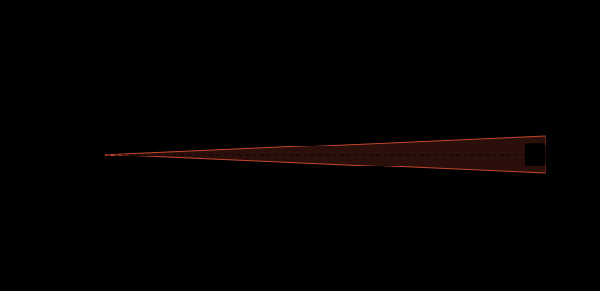
The standard-observer field visualised as a thumbnail held at arm’s length, set against the much larger angular extent of the full visual field. The standard deliberately samples only the cone-rich foveal centre.
It pays to be honest about what “the standard observer” is, because the phrase carries an authority its origins do not warrant. It is not a measurement of any real person. It descends from colour-matching experiments run in the late 1920s by W. David Wright and John Guild on, between them, only about two dozen British observers with normal colour vision, viewing a small foveal patch; the CIE averaged and idealised their results in 1931 into a single canonical set of curves. So the standard observer is an average over a handful of young adults, and it bakes in the pre-receptoral filtering of an average twenty-something eye — the yellowing crystalline lens, the macular pigment — that shifts measurably with age. Two real observers can return genuinely different colour matches and both be perfectly normal; the standard is a composite that may correspond to no living eye at all. We will lean on it constantly, because engineering needs a fixed reference and a fictional eye that everyone agrees on beats a real eye that no two people share. But the reference is a statistical fiction, and the places where real eyes depart from it — across ages, across individuals, across that 2°/10° divide — will matter later.
Three cones, then three numbers, then a standard set of three sensitivity curves to compute those numbers from any light: this is precisely the structure that lets colour-matching become linear algebra. Three receptors mean three axes; a spectrum becomes a point in a three-dimensional space; a match becomes an equation between two points. That three-dimensional matching space, and the experiment that pins down its axes, is where the next part of the argument lives.
There is one loose end. The fovea reads colour, but it is nearly useless in dim light, and the periphery that takes over after dusk is built from a different receptor entirely — the rods, one pigment, no colour, vastly more sensitive. As light falls and vision hands off from cones to rods, the apparent brightness of colours rearranges itself; a red that outshone a blue at noon can be the first thing to vanish at twilight. That handoff, and the shift that bears Purkyně’s name, belongs with the rest of the story of vision’s edges — colour blindness, the island where no one sees hue at all, the mathematics of seeing by moonlight — and that is exactly where the next post begins.
Four kinds of “match”
Before we go, one piece of vocabulary, because the whole rest of the series will lean on it and because the word “match” is about to start doing four different jobs.
When two lights “look the same,” there are four distinct things that can be meant, and conflating them is the source of arguments that never resolve. The strongest sense is that the two lights are physically identical — the same spectrum wavelength for wavelength. That is rare and not what reproduction ever achieves. The second sense is a metameric match: two different spectra that produce the same triple by equation , and so are indistinguishable to a given eye. The third is a match to me: a metameric match holds for a particular observer’s cone fundamentals, and because real fundamentals vary, a pair that matches for you may visibly differ for the person beside you. And the fourth is a match per the standard observer: the two lights produce the same response under the CIE’s averaged, fictional eye — the only sense an instrument can certify, and the one all of colour engineering is built on.
A concrete case makes the distinctions bite. The yellow you see on a sodium street-lamp is very nearly a single spectral line near ; the yellow on your phone screen is a mixture of red and green primaries with no power at at all. Tune the screen’s red and green until the two yellows produce identical under the standard observer, and you have manufactured a metameric match: an instrument reading the standard fundamentals will certify them equal, and they are equal in sense four. But the two spectra are wildly different — one a spike, one a double hump — so they are nowhere near a match in sense one. Hand the same pair to a colleague whose L pigment is shifted a few nanometres (a common, entirely normal variant) and the match can visibly fail for her: it was only ever a match to your fundamentals, sense three. And step the pair into your peripheral vision, where the cone mix changes, and even your own match can wobble. One physical pair of lights, four different verdicts, depending on which sense of “the same” you meant.
Notice that the definition makes the four senses one structure seen at different settings: a match is always the statement that the difference falls in the kernel of the cone map, and the four senses differ only in whose kernel you mean — nobody’s (physical identity), a fixed but arbitrary observer’s, your own, or the standard observer’s. Keep the four separate and a great deal of later trouble dissolves in advance: why two screens calibrated to match can look different in your peripheral vision, why a metameric match made under one light falls apart under another, why even a dress photographed once can be two colours at the same time. All of it traces back to the fact established here — that colour is three numbers read off a continuum by three overlapping curves in a patch of tissue smaller than a full stop, and that “the same colour” is therefore always a claim about a projection, never about the light itself.
Next: brown, moonlight, and an island where no one sees colour at all — the edges of human colour vision.